Why No Sales on My Website? Six Fixes Before You Buy Ads

Why no sales on my website? It's the question every founder asks the week their analytics start filling with visitors and their orders stay at zero. The average landing page converts at 5.89%, which means about 94 of every 100 people who land on a page leave without doing anything at all Networksolutions.
Picture a founder a few weeks into running a store she built on Lovable. The dashboard shows a few hundred visitors a week, climbing steadily. Orders: one, maybe two. Her first instinct is to spend more on ads, reasoning that more visitors must mean more sales eventually. She never stops to check whether the price is visible without clicking through three screens, whether the page loads in under three seconds on a phone, or whether the payment method her buyers actually use is on the page at all.
That instinct is the expensive one. Most small sites don't have a traffic problem. They have a conversion problem, and the six fixes for it cost nothing close to what another ad campaign does Consultwithkyle.
Why no sales on my website: traffic or conversion?
Before touching anything, work out which problem you actually have. A landing page converting at 5.89% is a benchmark to understand your numbers against, not a target to chase Networksolutions. If you're already above it, more traffic is the right next move. If you're well below it, more traffic just means more people leaking out of the same hole.
Here's the catch most founders miss: not every visitor who lands on your site has any intention of buying Dragonflydm. Someone who clicked from a social post out of curiosity, or landed from a search that barely matches what you sell, was never going to convert no matter how fast your page loaded. If the problem isn't your visitor count, it's almost certainly your conversion process Clicksgeek.
A quick diagnostic: segment your traffic by source and look at behaviour, not just volume. If visitors from search or direct traffic (people who typed your name or came back deliberately) are also leaving without acting, that's a conversion problem, not a traffic one. If only cold social clicks bounce immediately, that's expected, and it's not the leak to fix first.
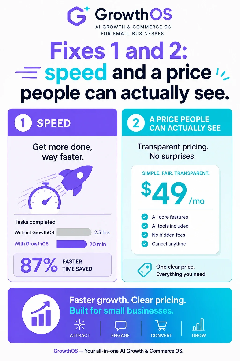
Fixes 1 and 2: speed and a price people can actually see
Open your own product page on a phone, on mobile data, not office wifi. Time it. If it takes more than a few seconds to become usable, you're losing people before they've seen anything you sell. Compress your images, remove unused scripts, and test again. This one change often moves the needle more than any other single fix, because a slow page punishes every visitor equally, intent or not.
Then check pricing. Open a product page as a stranger would and ask: can I see the price without logging in, without adding to cart, without clicking "get a quote"? Hidden or vague pricing reads as a trust problem even when it isn't one. If your margins need a quote for custom work, say so clearly and give a starting price range instead of nothing.
Fixes 3 and 4: one clear next step, and the payment method your buyer already trusts
Every page should have exactly one primary action. A product page that offers "Buy now," "Add to wishlist," "Share," "Compare," and "Contact us" with equal visual weight gives the visitor permission to do none of them. Pick the one action that matters and make everything else smaller or secondary.
Then look at checkout itself. Buyers across different regions expect different payment methods as the norm, not as an alternative: cards in one market, UPI in another, cash on delivery where trust in online payment is still building, mobile wallets, direct bank transfers. None of these is the "default" option with the others as backups; they're peers, and offering only one when your buyers expect another is a silent way to lose a sale at the last step. Where tax invoices apply, generating one automatically at checkout (GST, VAT, or your local equivalent) removes a question a business buyer would otherwise have to ask before paying. This is worth getting right: a checkout that matches how your buyers actually prefer to pay fixes more abandoned carts than almost any other single change, and it's worth reading through how better payment solutions at checkout improve sales if you haven't audited yours yet.
Fixes 5 and 6: proof, and the questions nobody answered
A visitor who's made it this far is close. What stops them now is doubt: is this real, will it arrive, what if it's wrong. Reviews, real product photos (not just the manufacturer's stock shots), a clear return policy, and a visible guarantee all do the same job: they answer "can I trust this" before the visitor has to ask it out loud. If your site is missing a dedicated policy or FAQ page, the five pages a small business site needs to do the actual selling is a useful place to check what's missing.
The last leak is the unanswered question at the exact moment of hesitation. Shipping time, sizing, compatibility, whether it works with what they already have. A visitor with one unanswered question rarely emails and waits; they leave. An FAQ section catches some of this. A chat assistant that can actually answer at the point of doubt, without the visitor having to leave the page, catches the rest. Adding a chatbot without breaking the customer journey is worth reading before you bolt one on badly.
Fix the cheap leaks first. Speed and visible pricing cost nothing but attention. Payment options and proof cost a weekend. Ads cost money every single day you run them.
Fix in order of cost, then buy traffic
Work through these in order, because each one is cheaper than the last and each depends less on spending money you don't have yet:
- Speed: compress images, test on real mobile data.
- Pricing: make it visible, no clicks required.
- One clear call to action per page.
- Payment methods your actual buyers expect, plus tax invoices where relevant.
- Proof: reviews, real photos, a guarantee, a clear return policy.
- Answered questions: FAQ plus something that responds in the moment, not after a support ticket.
Give yourself a week. Day one and two: speed and pricing. Day three: audit every page for a single clear action. Day four: fix checkout and payment options. Day five: add proof and policies. The remaining days: FAQ and a chat assistant. Only after all six are in place does it make sense to spend on ads, because now the visitors you already get will actually convert, and the ones you pay for will too.
If you'd rather not build fixes 4 and 6 by hand, Tyashin's checkout supports UPI, cash on delivery, and card payments with tax invoices generated automatically, and its chat assistant is built to answer exactly the kind of question that makes a visitor leave instead of buying.
Run the six-point check on your own site this week. If you'd rather have checkout and a chat assistant handled for you, take a look at Tyashin.
Have questions or ready to get started?
Get in touch with Tyashin